
The Foundation: Modular Grid Systems & Geometric Harmony
A mathematical construction grid is the architectural blueprint of an iconic mark. Instead of drawing curves by eye, a brand designer establishes proportional relationships using circular arcs, tangent intersections, root ratios, and golden modular intervals.
When shapes share mathematical DNA, the human subconscious perceives order, stability, and harmony. Irrelevant visual noise is eliminated, leaving only the pure, memorable silhouette of the mark.
Mathematical Rigor Meets Human Judgment
Pure geometry establishes consistency and structural strength; optical judgment gives a mark life, rhythm, and character. An enduring logo demands both.
Explore Logo Design Services ($200+)Mathematical Equality vs. Optical Perception (The Human Element)
One of the most common beginner mistakes in logo design is assuming that mathematical precision equals visual perfection. In reality, the human eye does not perceive geometric geometry mechanically:
A circle and a square with identical mathematical heights will not look the same size; the circle appears smaller because its curved edges touch the bounding boundaries only at tangent points. Here is how seasoned vector craftsmen optically compensate:
1. The Law of Overshoot
To appear visually equal to flat-topped letterforms or geometric boxes, rounded curves and apex points must extend slightly beyond the cap-height and baseline grids (typically 1.5% to 3% overshoot). Without this optical correction, curved marks appear shrunken and unbalanced.
2. Geometric Centroid vs. Visual Weight
The mathematical centroid of a triangle or asymmetrical geometric mark is rarely where the eye perceives its visual balance. For instance, the "Play" triangle icon inside a media button must be shifted slightly to the right of mathematical center to look visually centered to human viewers.
3. Horizontal vs. Vertical Stroke Tension
Horizontal lines naturally appear thicker than vertical lines of identical pixel width due to human binocular vision. Senior designers deliberately shave 3% to 6% off horizontal crossbars to achieve perceived optical equality.
The Multi-Scale Stress Test: From 16px Favicon to Billboard
A brand mark today must perform across an unprecedented range of physical and digital environments:
It must render legibly as a 16×16px browser favicon, a 32px mobile app icon on an Apple Watch screen, and an embroidered chest badge on polo shirts—while scaling seamlessly to a 10-meter outdoor highway billboard without losing clarity.
Marks constructed on mathematical grids excel at this stress test because their silhouette relies on high-contrast negative space and clean mathematical tangencies rather than intricate, fragile details.
- Micro-Scale Legibility: Survives extreme downscaling to 16px without turning into an illegible visual smudge
- Monochrome Versatility: Operates with 100% clarity in pure black, pure white, and single-tone laser engravings
- Infinite Vector Fidelity: Scalable in Adobe Illustrator (.AI, .EPS, .SVG) to any physical dimension with zero resolution loss
- High-DPI Edge Sharpness: Perfectly aligned to pixel grids for razor-sharp rendering on Retina and 4K displays
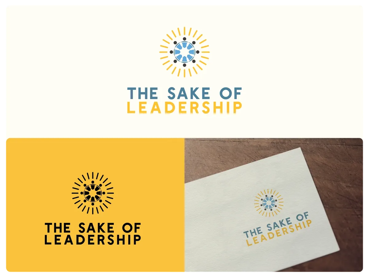
Case Study: Geometric Architecture in The Sake of Leadership
In my design for The Sake of Leadership, the mark required an authoritative symbol suitable for keynote seminar stages, book covers, and executive consulting portals.
The final emblem was constructed using an ascending modular triangle grid: three ascending geometric planes that form an abstracted "S" and "L" monogram while symbolizing executive ascent and strategic elevation.
Because the geometry was anchored to strict 60-degree angles and modular proportions, the mark feels permanently anchored, commanding instant respect in corporate and executive environments.
The Sake of Leadership Case Study
Explore the complete vector grid breakdown, typography pairings, and brand application for The Sake of Leadership.
View Case StudyWhy Businesses with Geometric Marks Command Premium Authority
In competitive markets, customers and investors make snap judgments within 50 milliseconds of landing on your website or seeing your packaging. Geometric, mathematically balanced marks communicate:
1. Discipline and Engineering Precision: Subconsciously signaling that your software, products, or consulting services are built with meticulous care.
2. Timeless Longevity: You avoid fleeting design trends and save your business from costly rebrands every 24 months.
3. Instant Recognizability: Clean geometry creates higher recall in customer memory, driving compound brand equity over years.
Frequently Asked Questions
Does every professional logo need to use the Golden Ratio (1:1.618)?
No. The Golden Ratio is one of many valuable proportion systems, but forcing every design into golden spirals often creates unnatural marks. What matters is internal mathematical consistency—whether using root-2 grids, isometric 60-degree angles, or modular scales—combined with optical correction.
What vector files are supplied for a geometric logo?
You receive native Adobe Illustrator (.AI) source files, editable .EPS vector masters, production SVGs, high-resolution PNGs, and favicon asset sets—all configured with exact vector paths.
Can a geometric logo be used for physical packaging and embroidery?
Yes. Geometric marks with clean curves and defined negative space are exceptionally well-suited for physical production, including embroidery, foil stamping, screen printing, and laser engraving.
Found this guide valuable? Share with founders & teams
Explore Related Services